An evidence-backed UX vision and strategy underpinned by heuristic evaluations and user-validated concepts, which lead to more users more easily completing their tasks.
- accessibility
- B2B
- compliance
- feedback analysis
- heuristic evaluation
- information hierarchy

Situation
Partners (hotels and property owners who rent out their residence as a vacation rental) manage their listing on Booking.com in the admin area called the extranet.
Within the extranet, partners found it difficult to complete compliance tasks, such as the Know Your Partner (KYP) form. This form is a regulatory requirement due to regulations like DSA and DAC7. They reported a lack of understanding regarding the form's purpose, difficulty locating it, and confusion about its current status.
This risked both their business and Booking.com, potentially leading to temporarily closing their listing.
Task
As the lead designer on this project I was tasked with solving these problems and ensuring partners ultimately have a better experience. By creating an evidence-backed UX vision, to serve as a north star, product and development teams would also benefit by having a clear path to work towards.
Action
The first thing I needed to do was see the full user journey across all communication channels to understand how, where, and when partners interacted with the compliance centre.
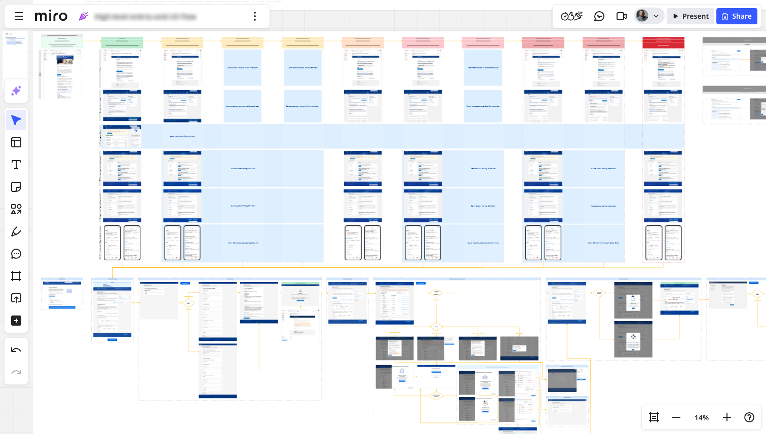
Miro board showing a full end-to-end user journey. I used a traffic light system to visualise risk up top, followed by a user journey below. It demonstrated how all communication channels point to a central page, then the journey branched out.
Then I conducted a thorough analysis of all available partner feedback. I reviewed hundreds of comments, categorising and sizing them into common themes. For instance:
- Can’t find form
- Don’t understand form
- Can’t use form
- Process and next steps unclear
- Repeated task/already completed
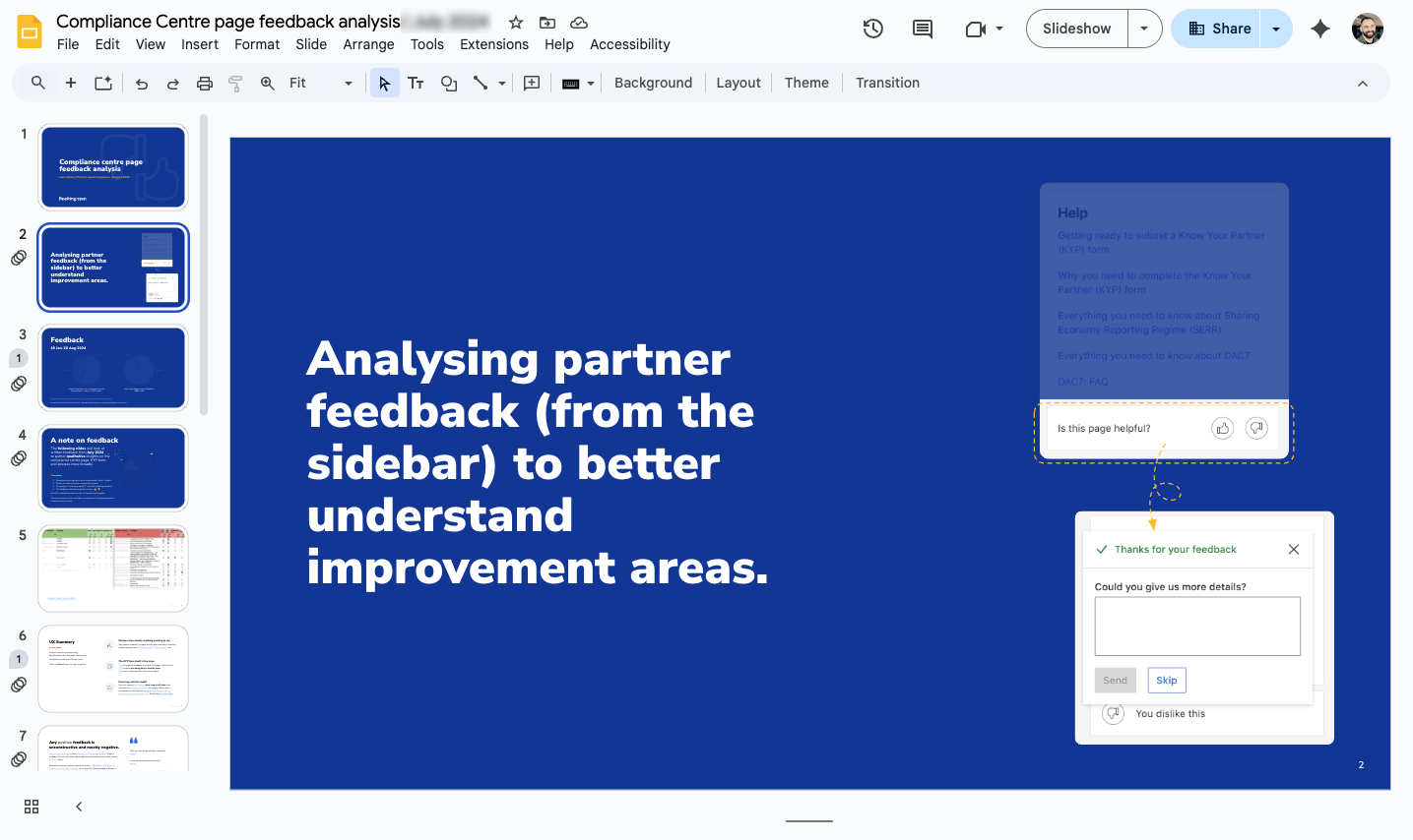
Google Slides presentation showing feedback collection. I shared this with my team and stakeholders to highlight the nuanced but critical issues partners faced.
Next I organised and facilitated an heuristic evaluation of the end-to-end journey with my peers and leads to gain insight and identify opportunities for design and content improvements. This ensured I wasn’t designing with my own assumptions.
Using Nielsen Norman Group’s 10 Usability Heuristics for User Interface Design, I encouraged participants to not only identify which heuristic might be cause for concern, but to score it on a scale of 1 to 5 that I created myself:
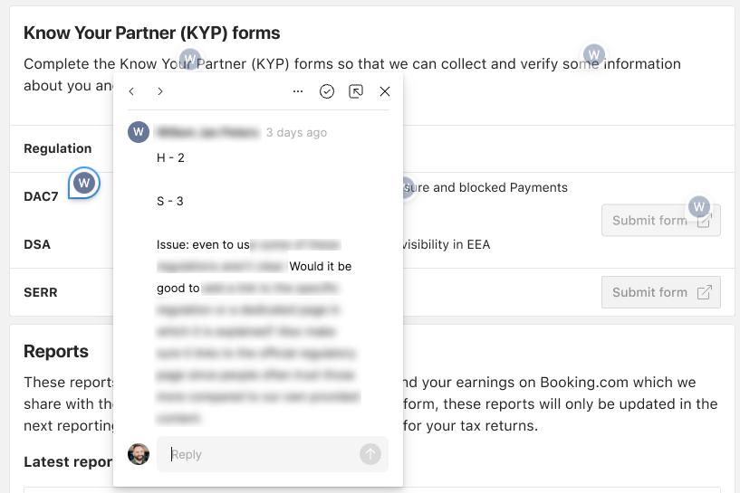
Screenshot from Figma showing feedback from an heuristic evaluation. Attendees highlighted which heuristic issue they observed and then scored it and added an explanation and solution.
- User can’t input, progress, or continue.
- Progress is possible, but requires extraneous focus and attention.
- Something is confusing, disorientating, or not overtly clear.
- A little effort is needed to understand, progress, or continue.
- Minor misuse of semantics, colour, design system, etc. Progress is not prevented.
I could then pool all the scores together into a “heuristic heatmap”. If a certain area scored lowest, that’s where improvements should really be focused.
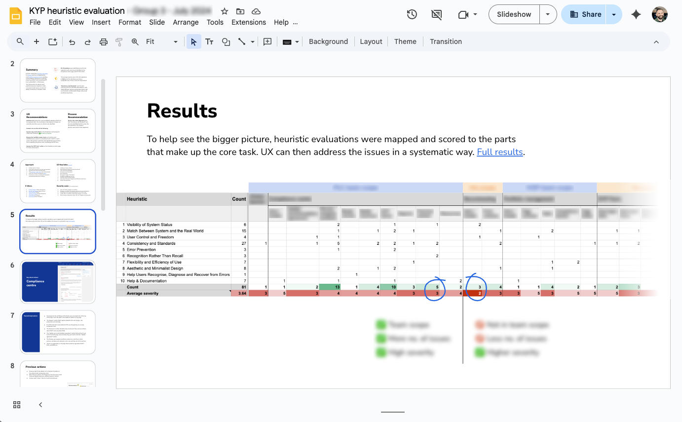
Google Slides presentation showing a heatmap of areas of concern. Low scores + how many, steered me towards focusing on that area to improve.
I drafted a UX recommendation and next steps for my team, proposing some short, immediate improvements whilst I could focus my full attention on a bigger, longer-term vision.
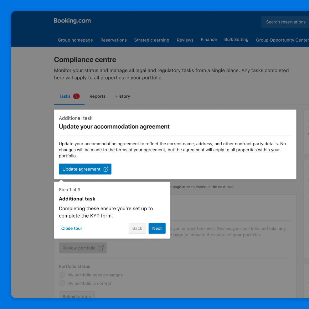
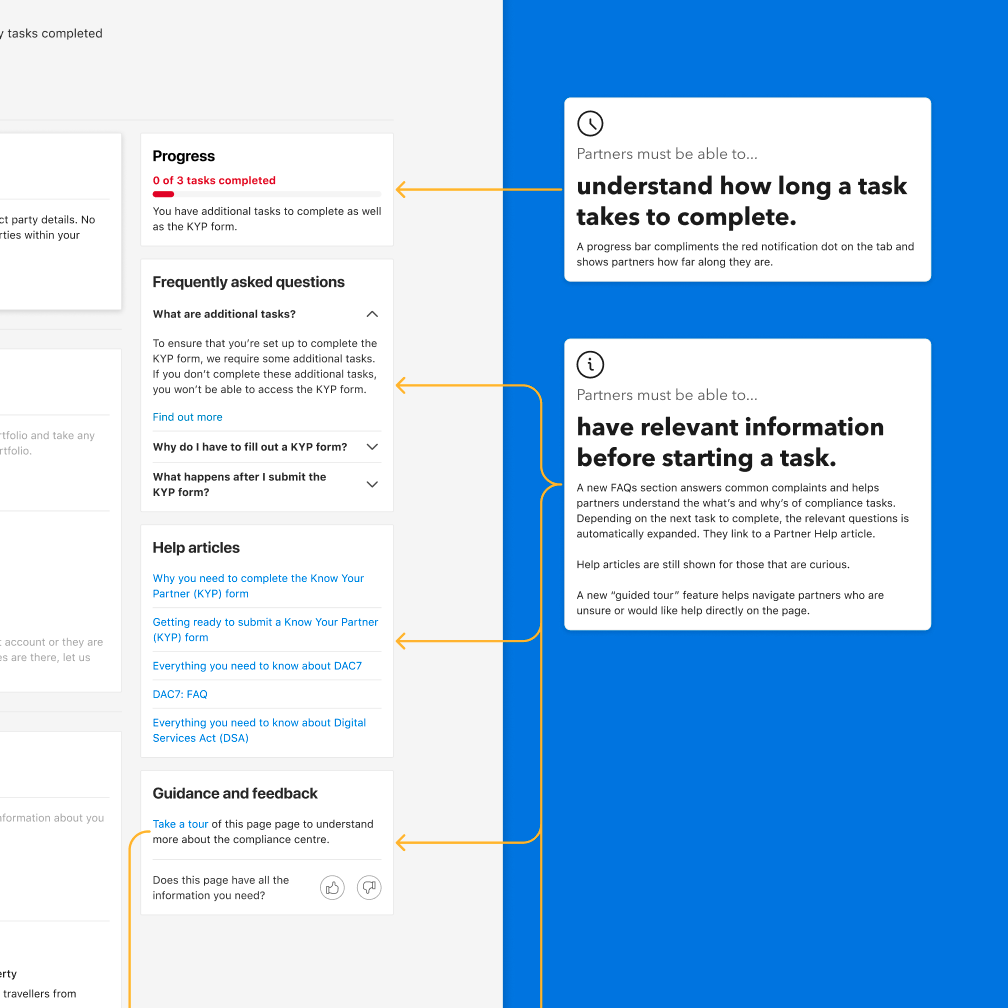
I also created a set of ten foundational principles to guide the UX vision. These principles were user-centered and chronologically ordered to ensure a logical and intuitive user journey. Some were; Partners must be able to…
- …know if their business is at risk.
- …have relevant information before starting a task.
- …understand why tasks failed and how to succeed.
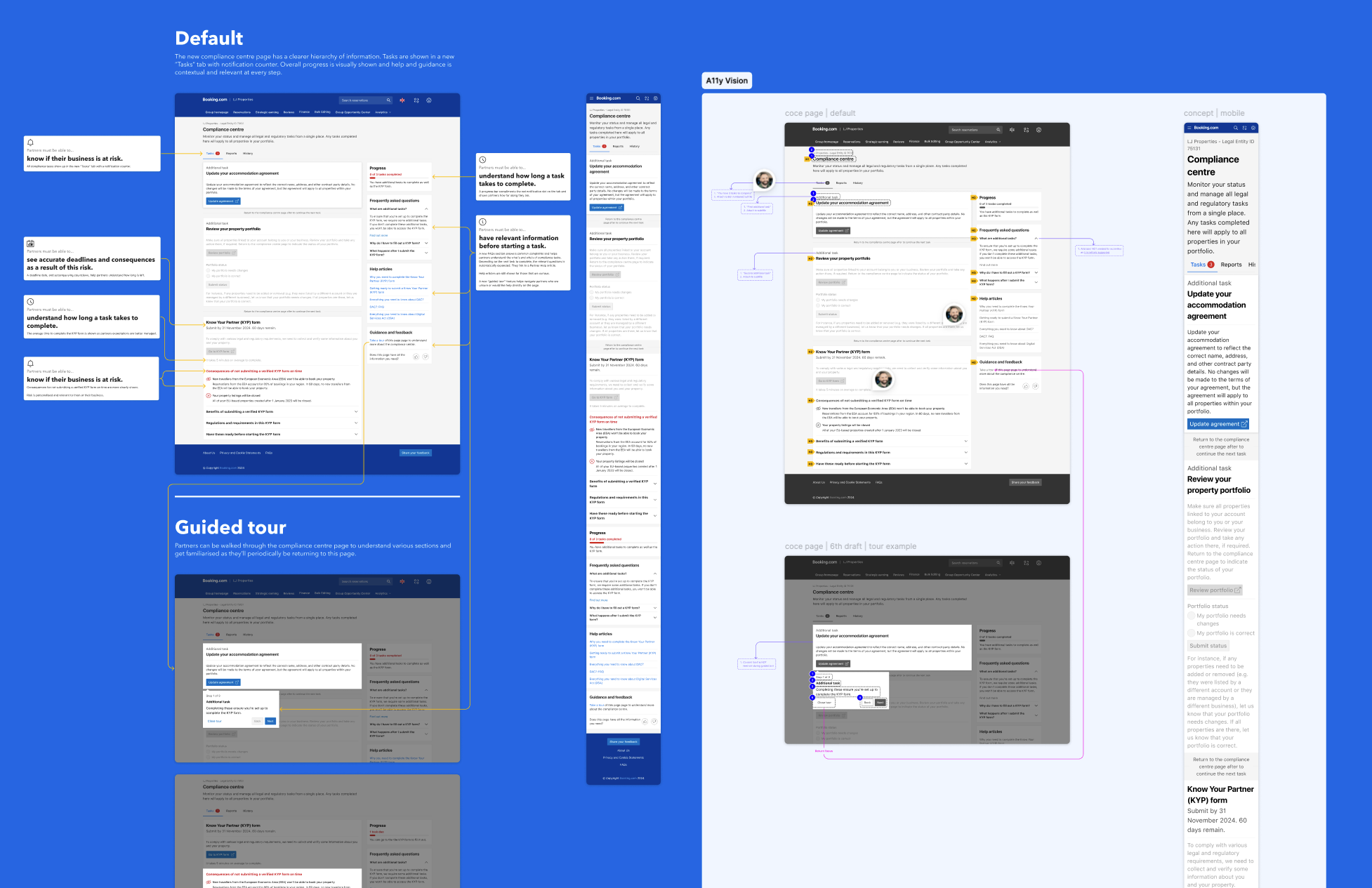
Now that I had a clear picture of the problem, and how to tackle it, I designed a first draft of the vision of the page and aligned with my lead writer on the content.
I teamed up with my researcher to have it reviewed with partners. Then, based on their feedback, I refined a final “artefact” and this would be what the team could work towards in the coming year.
Result
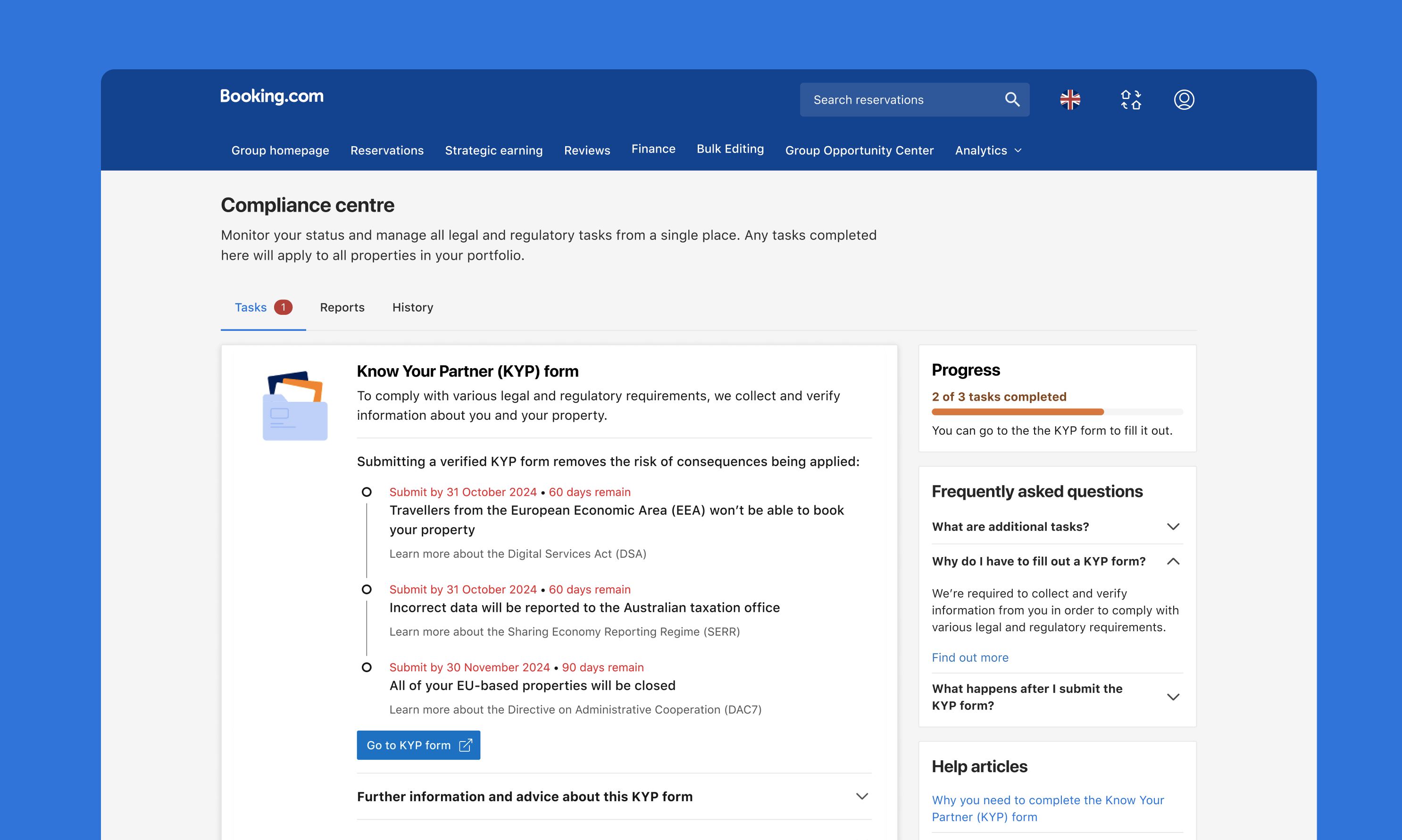
I designed an accessible, end-to-end, responsive compliance centre that accommodated various content states to support 45 languages.
UX vision of the compliance centre.
Drag the slider to see a before and after.
An accompanying UX strategy I created had the team start on foundational, architectural changes to the page.
Content was more logically grouped using tabs and help and support was now contextual. This enabled the page to be fit for the future and more sections and tabs were added as needed.
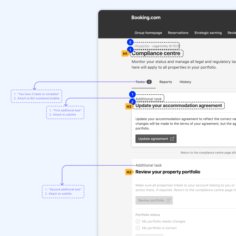
Marking up aria labels and reading order of certain elements.
Highliting an optionally triggered guided tour concept.
Explaining rationale behind certain page elements.
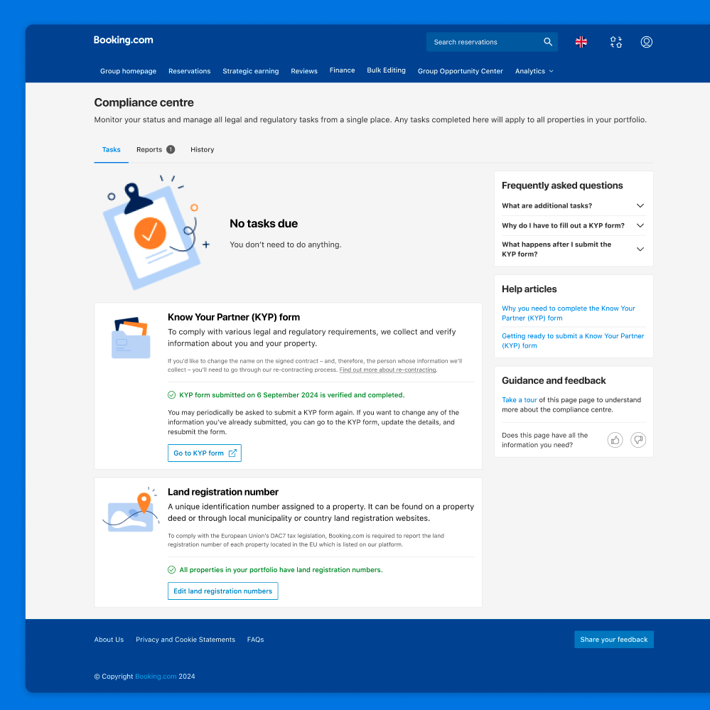
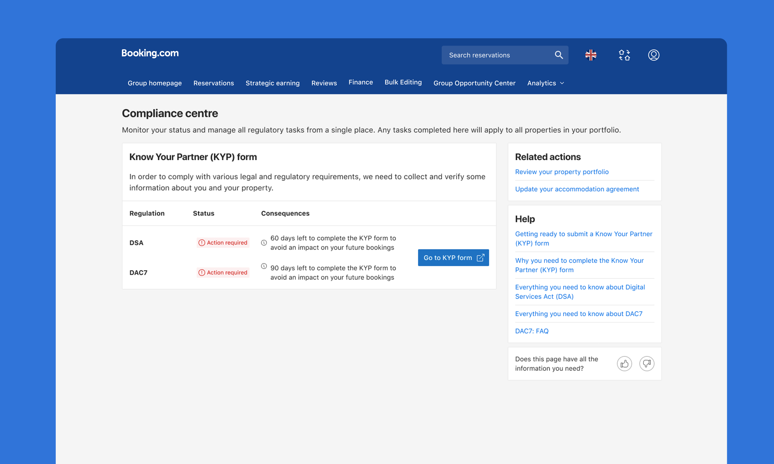
A successful page state showing there are no more tasks.
Accessibility issues were addressed too such as extensive screen reading order, focus order, and ensuring aria-labels were attached to elements where necessary.
Partners completed more tasks and more easily accessed their reports and documents.
What I learned
Compliance-related work is highly complex and critical to any business’s success. I learned this complicated subject in a handful of months, uncovered subtle, yet distinct user problems, and delivered an experience that benefitted user and business alike.
What colleagues said
“I expected a directional idea of where we’d be heading, maybe some high level sketches, food for thought etc, but instead, Liam came up with a fully fledged user experience, taking into account all learnings we have so far, as well as considering future scalability and best practices. He spent time with peers and craft seniors to review and strengthen his work, and used research to incorporate user perspectives. At the risk of sounding over the top or hyperbolic, this piece of work is easily some of the best design work I’ve seen during my 10+ years at Booking. It’s a great base for us to start with.”
– Principal Product Manager
“Awesmoe job on the live demo today! Just got some peace of mind. You nailed it.”
– Lead UX Designer