Deep-diving into behavioural metrics, validating concepts, and facilitating multi-team workshops, I redesigned a menu which led to incremental improvements.
- B2B
- information architecture
- menu
- navigation
- workshop facilitation

Situation
Partners (hotels and property owners who rent out their residence as a vacation rental) manage their listing on Booking.com in the admin area called the extranet.
The extranet menu has some hotel-specific terminology which some less-experienced partners expressed confusion and unclarity about. They found navigating to be challenging. They didn’t instinctively know where to go when looking for a specific page or feature.
This created an undesirable experience and resulted in partners not utilising all the extranet has to offer.
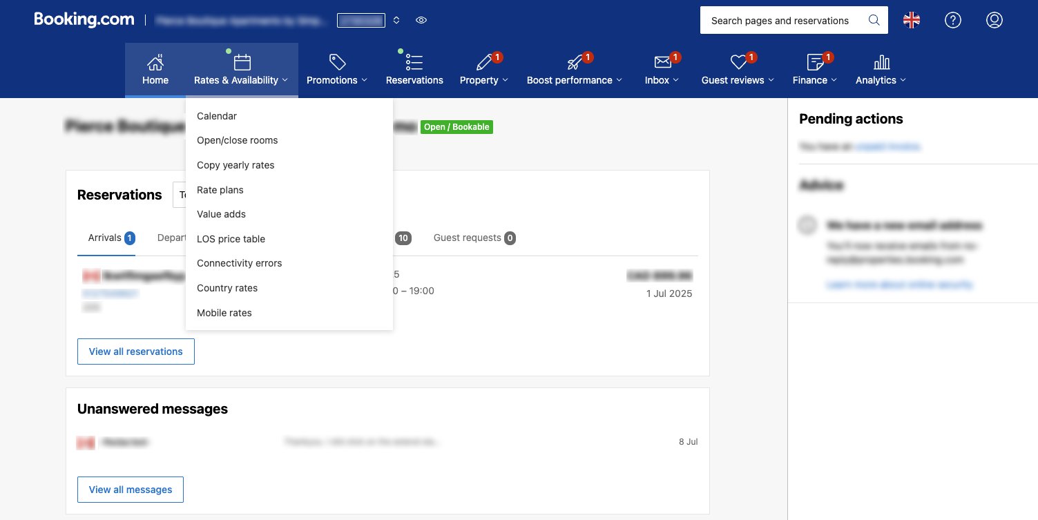
Extranet menu where partners navigate the admin area of their property listing.
Task
As the lead designer on this project, my role was shared with the lead writer, and together we were tasked with redesigning the extranet menu, to make it more intuitive to use and navigate.
We had to ensure discoverability and comprehension of information for less experienced partners whilst not radically redesigning anything that could alienate experienced partners either. A delicate tightrope!
Action
I kicked off the project with a deep dive into the existing experience. I needed to understand how partners used the extranet menu, and for that, I turned to behavioural metrics to see which menu links were most clicked. Seeing which links were frequently interacted with, indicated common tasks and actions partners take from the menu.
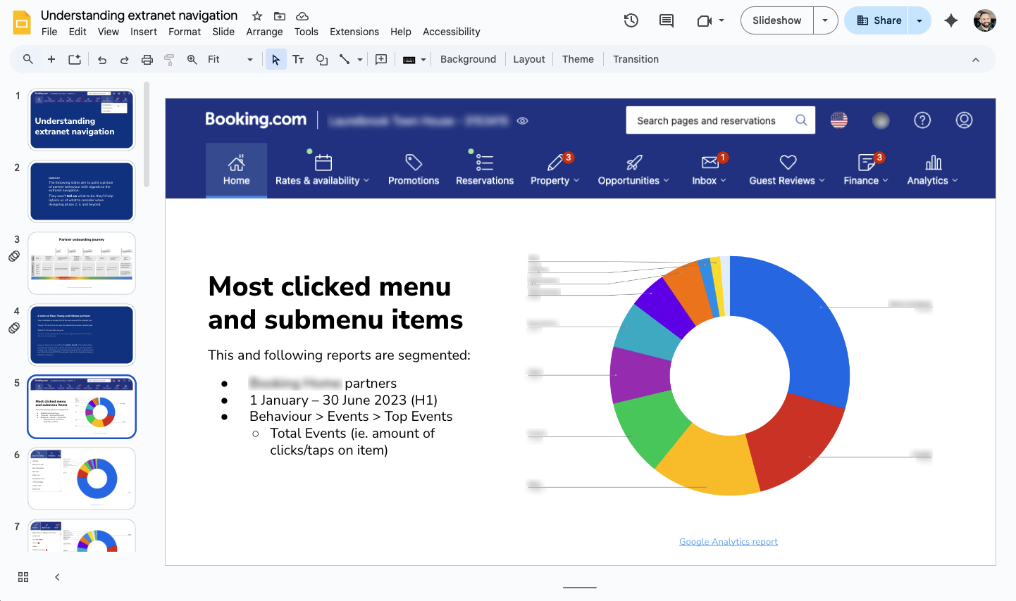
Google Slides presentation showing extranet navigation analysis.
I gathered and analysed all the behaviour metrics I could; menu link clicks, search terms, and visited help pages. This helped my writer, team, and I better see how partners navigate the extranet and what they’re looking for.
With this clearer picture, I drafted a design that explained what each menu was for, and helped lay out the logically grouped submenu links with my writer. Then, aligning with our researcher, we usertested some desktop and mobile prototypes to validate the concept.
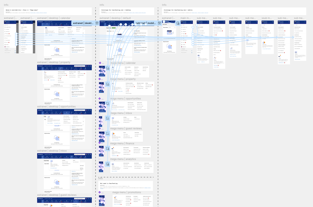
Figma prototype to test with Partners.
With partners reporting positive sentiment, the concept was validated. Next, I wanted to ensure a broad multi-team consensus. For this, I designed and facilitated a multisession workshop, where every team whose pages, features, and products are accessed via the menu, would co-create “their” part of the menu. I encouraged active participation and collaboration to rename, regroup, and redesign aspects of the menu.
Card sorting exercise; attendees were tasked to group existing submenu links into four logical grouped sections.
Some exercises I utilised were:
- Card sorting; to see which groups attendees thought submenu links would belong
- Renaming and writing; to crowd-source writing input
- Metric mapping; to meassure which areas of the business could be impacted
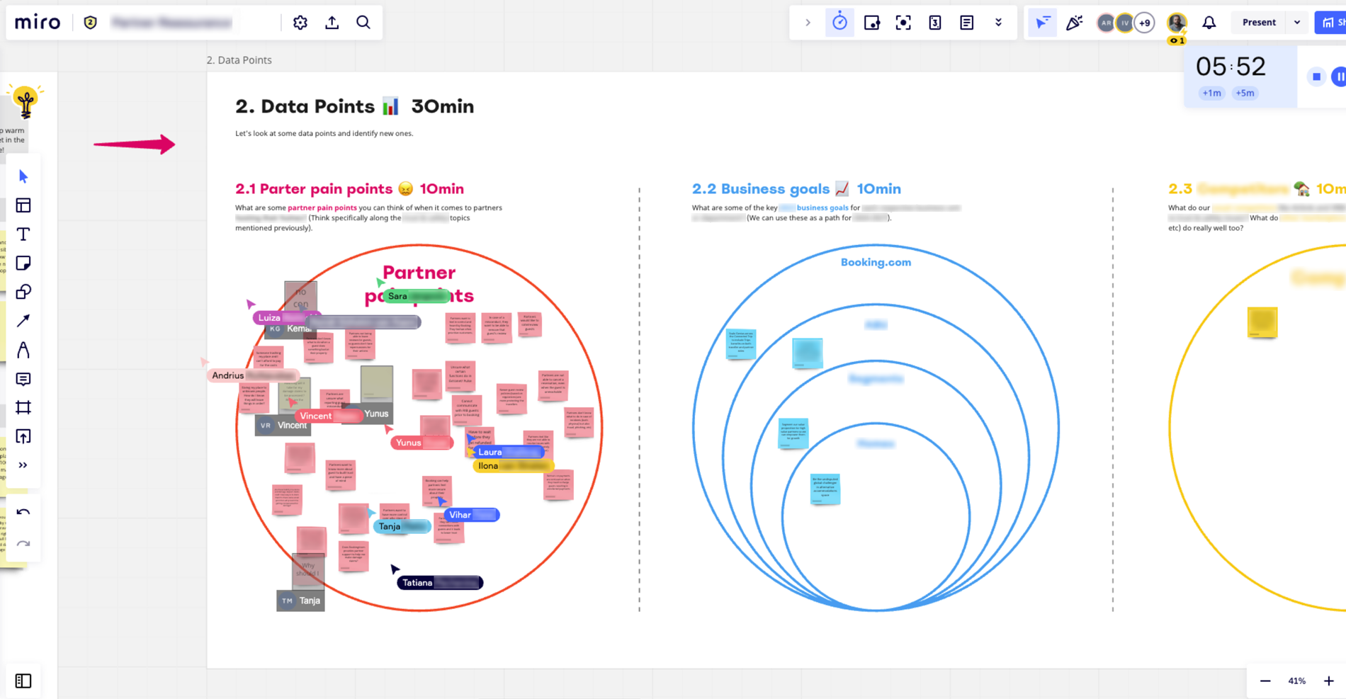
A workshop exercise in Miro. Attendees were tasked with identifying pain points and metrics.
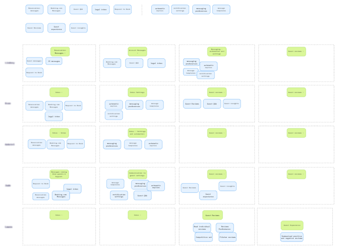
Post-workshop, I utilised a histogram matrix, to systematically see the hundreds of workshop inputs in a bird’s eye view. This helped me and especially the writer see what consensus led us toward.
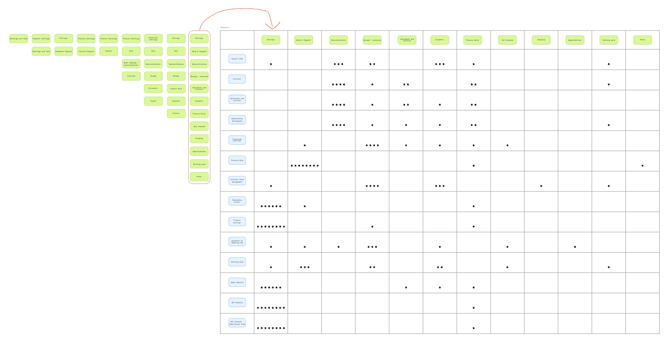
One of many histogram matrices indicating submenu naming and grouping consensus.
Result
80+ person workshop experience
Spread acorss multiple days, I was able to organise, plan, and facilitate the majority of partner-facing product teams.
Synthesise 100’s of stickies
Methodlically approach workshop input to reach broad consensus.
Experiment learnings
Subtle yet distinct nuances between successes and failures.
Whilst extensively validated and co-created, when the existing and new menus were A/B tested, the new menu design failed against some key internal metrics. However smaller changes on specific sections and areas were tested and they proved successful against user behaviour and key internal metrics.
What I learned
I learned something valuable in failure. Sometimes swinging big is noble and right, and sometimes step-by-step experiments are much more impactful. Gaining more facilitation skills and growing my confidence, I found I have a natural ability to rally people of various crafts and experiences together to solve a common challenge.
Next time I would ensure laser-focus on the experiment approach to set it up for success.
What colleagues said
“Currently in our first workshop and Liam is killing it!”
– Product Manager
“That was one of the best workshop sessions I’ve ever attended!”
– UX Writer